So, I dunno if this is just exciting news for me or not, but I want to talk about our new branding rolling out over the next few weeks.
You may have noticed our current brand imagery (as of June 2025) is a silhouetted goat standing on its hind legs. Seems logical for a brand named Dancing Goat, right?
A short history of nearly every logo
Unfortunately, I didn't put much thought into it when we started the Dancing Goat brand. And it turns out that any coffee shop or roaster with a similar name has used a - you guessed it - goat standing on its hind legs to visually represent a dancing goat.
Adding to my dismay, I didn't even create a unique goat image. It's a Shutterstock special. What a crap marketer I am!
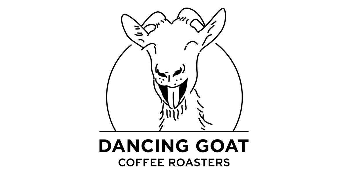
So, in a fit of creative energy, I briefed a fabulous designer pal [shoutout to Brenda B] to create new imagery for the Dancing Goat brand.
Wait, why isn't the goat standing on two legs, you say?
Aha, thank you eagle-eyed reader. Good observation. The goat's face says it all - a look of bliss that captures the emotion of the dance. And, if we're getting deep, the look of contentment you'll experience after a Dancing Goat coffee.
What's with the circle bit?
It's a callback to the original logo's circle, or it's the spotlight of a dancefloor, or it's a coffee bean. It's also a nice shout to the outro credits of Hanna Barbara cartoons, which tickles me.
How come the font's so formal looking?
Yeah nah, I just like the contrast between the playfulness of the goat and the formality of the Gotham font. And... because Batman.
So, yeah, that's that really. Hope you like it.


Leave A Comment